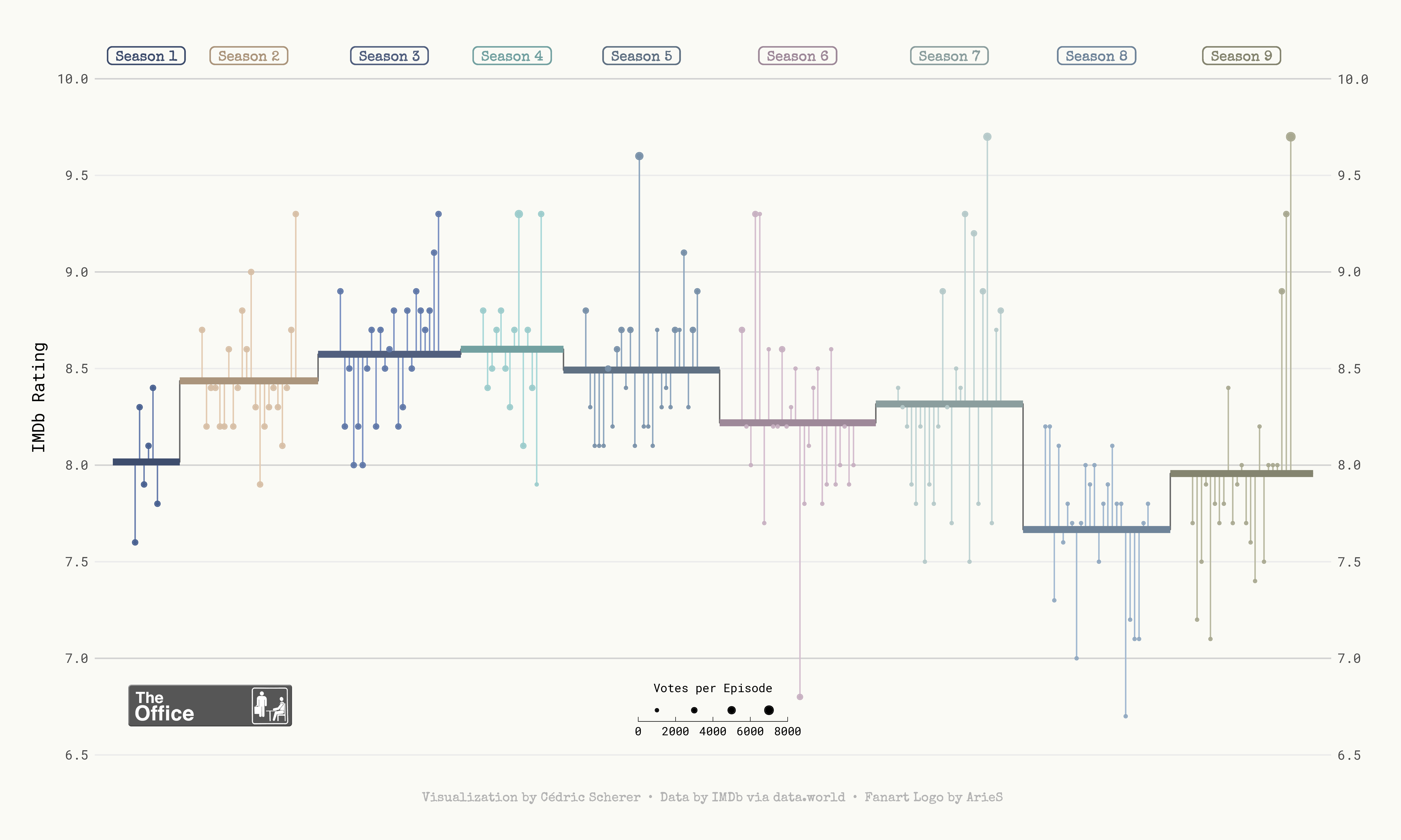
Lollipop Plot of The Office US IMDb Reviews
Five months ago I started an internship with Amazon and I’ve learned an inordinate amount from my colleagues. The use of plots to debug models is perhaps the most useful learning.
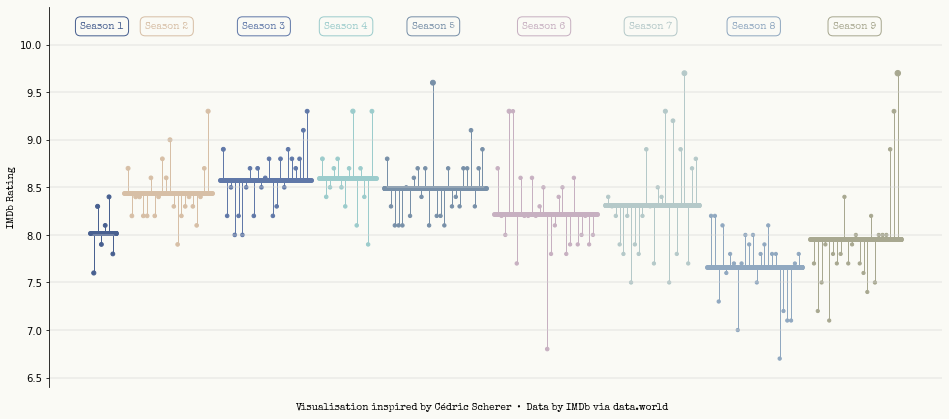
Inspired by my colleagues, I’d like to improve my plotting skills. So, from time-to-time, I’ll try creating a figure that I would not usually make to try and broaden my knowledge. To focus on the skill of plotting, I’ll remove any need for creativity by trying to replicate plots I’ve seen and liked. Cédric Scherer is someone I’ve followed on Twitter for a while, and I’ve always admired the plots that he creates. In this first post I’ll try and replicate the lollipop chart Cédric made the IMDb reviews of the The Office US.
Unlike Cédric’s plot, I’ll be creating my plot in Python so we’ll have to do a bit of data wrangling first.
Data Wrangling
| |
We’ll read our data in from the R for Data Science Github repository. We’ll store our data in a Pandas dataframe, the first 5 lines of which look as follows:
| |
| season | episode | title | imdb_rating | total_votes | air_date | |
|---|---|---|---|---|---|---|
| 0 | 1 | 1 | Pilot | 7.6 | 3706 | 2005-03-24 |
| 1 | 1 | 2 | Diversity Day | 8.3 | 3566 | 2005-03-29 |
| 2 | 1 | 3 | Health Care | 7.9 | 2983 | 2005-04-05 |
| 3 | 1 | 4 | The Alliance | 8.1 | 2886 | 2005-04-12 |
| 4 | 1 | 5 | Basketball | 8.4 | 3179 | 2005-04-19 |
We’ll now process the data, the steps of which are as follows:
- Create a continous label that indexes the epsiode and season number
- Re-case the season number as a categorical variable
- Calculate the mean IMDb rating at a Season-level
- Scale the total number of votes per episode down into the range $[10, 30]$
| |
The data is now in a form that we can work with. Before we start making a plot though, we should define some upfront variables. The only two we’ll need are a list of hex colours that I’ve lifted out of Cédric’s original plotting code, and a unique list of season numbers. I’ll also map the colours into our main dataframe as an additional columns; this will come in handy later one when scatter the observations as points.
| |
The final piece of wrangling required for our data is a little bit of a hack, but we must introduce some pseudo-spacing on the x-axis when there is a jump from the last episode of one season to the first episode of the next season. This is purely for aesthetics to ensure that there is some spacing between the points and office_datatween seasons. To do this, we’ll loop over our earlier created epsiode index variable and increment it by 3 when the season number jumps.
| |
Custom Font
In the original plot, the Special Elite font is used. This is a case where I had no idea that one could load in custom .tff files to use within their figures. However, it is incredibly simple through the following code snippet where we read in the font’s .tff file and load it into Matplotlib’s FontProperties object.
| |
Making the plot
We can now make the plot! Now the plot had several layers to it, so I’ll break out here the steps that I’ll be taking in the below code to avoid disrupting the code. Those steps are as follows:
- Define our figure’s canvas and box properties that will be used for labelling each season.
- Create some lightly coloured horizontal lines at 0.5 increments.
- Loop over each season’s subset of data and do the following.
- Create a horizontal line to represent the season’s mean rating score.
- Softly round the line’s edges using a point place on the line’s periphary.
- Centrally add a label above the horizontal line to indicate the corresponding season number.
- For each of these steps, there is a unique colour per season.
- Plot a point per episode for the corresponding IMDb review score.
- Create a vertical line that connects the score of each episode to the constituent series’ mean score. This aesthetic is why the plot is called a lollipop chart!
- Remove ticks from the x-axis as they only correspond to an arbitrary indexing number so aren’t particularly useful here.
- Set the plot’s background colour.
- Label the plot’s y-axis.
- Despine all the but the left-hand spine.
- Add a caption to the plot.
| |
Conclusion
That’s it, we’re done! I’m pretty happy with how this turned out and it’s been an interesting plot to make as it’s simply a collection of carefully place circles and lines. This is certainly a refreshing way to think about creating plots as it removes any mentblockers
| |
Author: Thomas Pinder

Last updated: Sat Nov 06 2021

Python implementation: CPython
Python version       : 3.9.7
IPython version      : 7.29.0

pandas    : 1.3.4
numpy     : 1.21.4
matplotlib: 3.4.3

Watermark: 2.2.0